Introduction to Wall Colors and Atmosphere
When it comes to interior design, wall colors play a pivotal role in establishing a home’s atmosphere. The choice of color can significantly influence the emotional and psychological state of individuals within any living space. Understanding the impact of color psychology is essential for creating a harmonious environment. Colors possess unique psychological attributes that can evoke different emotions and feelings, shaping our perceptions and experiences within a room.
For instance, warmer tones such as reds and oranges are often associated with energy, comfort, and creativity, encouraging social interaction. Conversely, cooler shades like blues and greens are thought to instill calmness and tranquility, making them ideal for bedrooms and relaxation areas. As such, selecting the right wall color can effectively enhance the quality of life by aligning the mood of a room with its intended use.
The interior design landscape has seen various trends that guide homeowners in their selection process. Neutral palettes remain popular for their versatility, allowing the incorporation of varied decor styles without overwhelming a space. Additionally, bolder hues are gaining traction, often employed as accents to create focal points within a room. As we delve into the contemporary trends and practical tips surrounding wall colors, it is crucial to prioritize harmony and balance, ensuring that the chosen tones contribute positively to the overall ambiance.
In doing so, homeowners can transform their living spaces into personal sanctuaries that reflect their tastes while simultaneously fostering a welcoming atmosphere. By carefully considering the implications of wall colors, one can significantly elevate the aesthetic appeal and emotional resonance of any interior space.
Understanding Color Psychology
Color psychology is an essential aspect of interior design that explores how colors influence human emotions, behaviors, and perceptions. Each color has its own unique set of associations and can evoke varying feelings depending on cultural contexts and personal experiences. Understanding these principles can greatly enhance the process of selecting wall colors to create a harmonious atmosphere within a home.
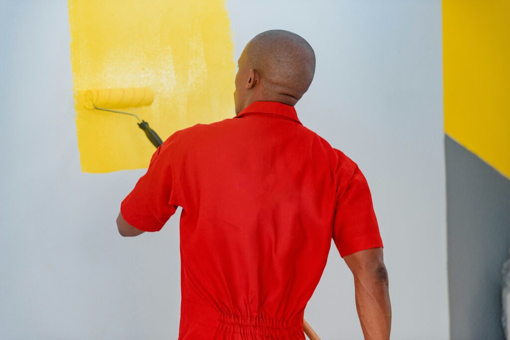
Primary colors—red, blue, and yellow—represent the foundation of color theory and carry significant psychological implications. Red is often associated with passion, energy, and warmth, making it a popular choice for spaces intended for socialization, such as living rooms. In contrast, blue is linked to calmness, stability, and tranquility; this color tends to promote relaxation in bedrooms or meditation spaces. Yellow, on the other hand, is known for its stimulating and cheerful qualities, perfect for brightening spaces like kitchens or sunrooms.
Secondary colors, which result from mixing primary colors, extend the emotional spectrum. For example, green—created from blue and yellow—symbolizes growth and harmony, making it an excellent option for areas where balance is desired, such as home offices or indoor gardens. Orange conveys excitement and enthusiasm, suitable for creative spaces or exercise rooms. Understanding these associations can significantly affect the choices made when designing a home.
Neutral colors—such as whites, grays, and beiges—provide a backdrop that allows for flexibility in design. These shades can evoke feelings of simplicity and sophistication while also providing a calming influence. Integrating neutral tones with more vibrant colors can create an inviting atmosphere, striking a balance between serenity and stimulation. Recognizing the implications of each color, both individually and together, is crucial when aiming to create cohesive, emotionally resonant spaces in a home.
Current Popular Interior Design Trends
In the realm of interior design, wall colors play a pivotal role in setting the aesthetic tone of a space. Currently, several key trends are shaping the choices homeowners and designers make when selecting wall colors. Among these, minimalism, maximalism, and the use of bold hues stand out as the most influential movements.
Minimalism continues to be a strong trend, characterized by simplicity and functionality. The walls in minimalist designs are often adorned with neutral tones such as whites, grays, and beiges. These colors serve to create a serene and uncluttered environment, allowing for a sense of tranquility. By keeping the wall colors subdued, minimalist design emphasizes clean lines and open spaces, fostering a peaceful atmosphere conducive to relaxation and focus.
Contrasting the simplicity of minimalism, maximalism celebrates exuberance and individuality. This trend encourages the use of vibrant colors and intricate patterns that evoke a sense of personal expression. Walls painted in rich jewel tones or adorned with bold wallpaper can transform a room into a vibrant gallery, reflecting the homeowner’s unique personality. Maximalist interior design thrives on layering textures and colors, creating a visually stimulating backdrop that challenges traditional conventions of restraint.
Another prominent trend is the rising popularity of bold hues. These striking colors, such as deep blues, vivid greens, and fiery reds, are increasingly being used to create focal points within interior spaces. A feature wall painted in a bold color can dramatically enhance the overall ambiance and become an eye-catching centerpiece. The strategic application of bold wall colors adds depth and energy to a room, inviting creativity and engagement.
Ultimately, these trends in wall colors highlight the evolving landscape of interior design, offering a spectrum of choices that cater to various preferences and lifestyles. Each trend fosters a distinct atmosphere, allowing individuals to curate spaces that resonate with their personal style and preferences.
Choosing a Color Palette
Selecting an effective color palette is crucial for creating a harmonious atmosphere within your home. The right palette not only enhances the aesthetic appeal of a space but also influences the mood and perception of the environment. A well-curated color scheme can transform interiors, promoting feelings of comfort and tranquility.
One method for combining colors is through a monochromatic scheme, which involves using variations of a single color. This approach allows for subtle changes in hue and saturation, creating depth while maintaining a cohesive look. By incorporating different textures and materials, such as fabrics, paint, and decorative objects, the monochromatic palette can feel dynamic and layered without overwhelming the senses.
Another technique is the use of analogous colors, which consists of three colors that are adjacent to each other on the color wheel. This strategy facilitates a smooth and natural transition between hues, perfect for fostering a serene vibe across various spaces. For instance, pairing shades of green and blue can evoke the calming essence of nature, making it ideal for areas intended for relaxation.
In contrast, complementary color schemes involve selecting colors opposite each other on the color wheel, such as blue and orange or red and green. This bold choice creates a vibrant visual impact, ideal for spaces that encourage interaction or energy. It is essential, however, to use complementary colors judiciously to avoid an overwhelming effect. Balancing these shades with neutral tones can help tone down their intensity while still maintaining a striking visual appeal.
Ultimately, the key to a successful color palette lies in considering the overall mood you want to establish and how different colors interact with lighting, space, and furnishings. By thoughtfully selecting and combining colors, you can create a cohesive and inviting environment that resonates with your personal style.
Factors to Consider When Selecting Wall Colors
Choosing the right wall color is a fundamental aspect of interior design that can significantly affect the ambiance of a space. When selecting wall colors, homeowners should consider several essential factors to ensure a harmonious atmosphere in their living environment.
First and foremost, natural light plays a pivotal role in how colors are perceived. A room flooded with natural light may be better suited for warmer tones, which can enhance the brightness and create an inviting feel. Conversely, spaces with limited natural light may benefit from lighter wall colors that help to reflect whatever sunlight is available, making the room appear more open and airy.
Another critical factor is room size. Smaller rooms can become visually overwhelmed by dark, bold colors, while lighter shades can create an illusion of more space. On the other hand, larger rooms might benefit from deeper tones, which can add warmth and intimacy. Homeowners should consider the proportions of their space when deciding on wall colors, ensuring the color enhances the overall dimensions rather than detracts from them.
Existing furnishings must also be taken into account. Wall colors should complement the furniture, artwork, and décor already present in the room. By choosing hues that coordinate well with existing elements, homeowners can create a cohesive design that feels intentional and well thought out. This coordination may involve selecting shades that are either within the same family or that possess contrasting qualities to create visual interest.
Lastly, the intended use of the space should guide the selection process. Different colors can evoke various emotions and responses; for instance, soft blues and greens are often associated with calmness, making them suitable for bedrooms or relaxation areas. Meanwhile, vibrant reds and yellows might be better suited for dynamic spaces like kitchens or playrooms, encouraging energy and activity. By considering these factors carefully, homeowners can select wall colors that contribute to a harmonious atmosphere throughout their home.
Techniques for Visual Balance with Color
When it comes to selecting wall colors that create a harmonious atmosphere, understanding visual balance is crucial. One common approach is the 60-30-10 rule, which helps establish a pleasing ratio of colors in a given space. According to this rule, 60% of the room should feature a dominant color, typically found on the walls; 30% should be a secondary color, often utilized in furniture; and the remaining 10% can be an accent color, added through decor items such as cushions and artworks. This balanced approach not only enriches the overall design but also ensures that no single element overwhelms the others.
Another effective technique for achieving visual balance is color blocking. This strategy involves applying two or more contrasting colors in different sections of the wall, creating a vibrant yet organized look. For example, a living room could benefit from half of its wall painted in a bold blue hue with the upper portion in a soothing white. Such division captures attention and fosters engagement, allowing individuals to appreciate the interplay of colors while maintaining visual order.
Layering is an additional technique that can enhance visual balance within a space. This method entails the use of various shades and tints of the same color family throughout the décor. By incorporating different tones—perhaps soft pastels or deeper hues of a specific color—the overall aesthetic becomes cohesive yet intriguing. Layers can be introduced through wall finishes, textiles, or even furniture, ensuring that the space feels dimensional while still aligned with the overarching color scheme.
Utilizing these techniques, namely the 60-30-10 rule, color blocking, and layering, can guide individuals in their quest for a harmonious environment. By thoughtfully integrating balance through wall colors, one can create spaces that look visually appealing and invite comfort and tranquility.
Using Accent Walls Effectively
Accent walls serve as a powerful tool in interior design, allowing homeowners to create a focal point within a room while maintaining a cohesive look. The concept revolves around painting one wall a different color or texture than the other walls, thereby drawing attention and enhancing the overall atmosphere of the space. Choosing the right wall for an accent is crucial; typically, the wall that stands out due to architectural features, such as a fireplace or a large window, is ideal for this purpose.
When selecting the color for an accent wall, consider the existing color palette and decor of the room. A bold shade, such as deep blue or vibrant red, can energize a space and create visual interest, whereas softer tones, such as muted greens or grays, may evoke tranquility and balance. It is essential to ensure that the accent color harmonizes with the overall design theme; complementary colors can enhance this effect, while contrasting hues can produce a more dynamic atmosphere.
To further augment the impact of an accent wall, various techniques can be employed. Textured paint, wallpaper, or wood paneling can add depth and dimension, making the accent wall more visually striking. It is also beneficial to consider lighting; strategically placed fixtures or natural light can highlight the color and texture, transforming the ambiance at different times of the day. Additionally, incorporating decor elements, such as artwork or furniture that mirrors the accent wall color, can create an interconnected look throughout the room.
Overall, when executed thoughtfully, accent walls not only enhance visual appeal but also contribute significantly to the room’s atmosphere, making them a valuable feature in modern interior design.
The Role of Textures and Finishes
When it comes to selecting wall colors, the choice of textures and finishes plays an instrumental role in shaping the overall atmosphere of a room. These elements can significantly influence how colors appear and how they contribute to the desired mood. For instance, matte finishes tend to absorb light rather than reflect it, creating a cozy, understated ambiance. This quality makes matte surfaces particularly suitable for spaces designed for relaxation, such as bedrooms or reading nooks.
On the other hand, gloss finishes provide a reflective surface that can brighten a room and make colors appear more vibrant. Such finishes are often favored in modern spaces, giving them a sleek and polished look. The glossy surfaces also tend to reveal imperfections more readily, thereby requiring diligent preparation to ensure a smooth application. Additionally, the reflective quality can amplify natural light, producing an energizing atmosphere that’s perfect for areas like kitchens or living rooms.
Satin finishes present a middle ground between matte and gloss, combining both qualities to offer a soft sheen. They are highly versatile, making them a popular choice for hallways or children’s playrooms, where durability and aesthetic appeal are both essential. Furthermore, textured wallpaper can add an extra dimension to wall colors. This option allows homeowners to incorporate patterns and tactile elements, enhancing visual interest and depth in the room. Textured wallpapers can also serve as an excellent backdrop for bolder color choices, creating a striking contrast that elevates the overall design.
Ultimately, the interplay between wall colors, textures, and finishes can define the character of a space. By thoughtfully selecting a combination of these elements, one can enhance the ambiance and achieve a harmonious atmosphere that resonates throughout the room.
Conclusion and Final Thoughts
In this exploration of wall color choices, we have emphasized the importance of selecting hues that contribute to a harmonious atmosphere within various interior spaces. The colors we choose for our walls play a pivotal role in defining the overall character and mood of our homes. As we delve into the world of interior design trends, it becomes evident that thoughtful wall color selection is not merely an aesthetic choice but a foundational element that influences our emotional well-being.
Throughout this guide, we have encountered a diverse array of popular wall colors, from soothing pastels to bold statements. Each color evokes distinct feelings, enhances particular aspects of a room, and aligns with current design trends. It is essential to consider how these colors interact with natural light, room size, and the existing furnishings to create a cohesive look that reflects your personal style. As trends evolve, so too do the ways in which we can integrate color into our spaces creatively and effectively.
Ultimately, the journey of choosing wall colors should inspire you to experiment and discover what resonates with your individual preferences. Whether you lean towards classic neutrals or vibrant tones, make choices that not only follow the latest trends but also ensure comfort and familiarity in your living environment. The key takeaway from this discussion is that wall colors are a means to express yourself, foster serenity, and create an inviting atmosphere. So, we encourage you to explore various options, trust your intuition, and embark on this coloring adventure with confidence.